The press name was inspired by this passage in Jan Tschichold’s The Form of the Book:
The author fears the typesetter, the printer fears the binder, and the designer is afraid of all four. He feels responsible. Yet, in spite of eagle eyes and the greatest circumspection, like the bodyguard of a dictator, he knows that mistakes will happen. He’s been there. So he leaves both fame and shame to the pedestrians who, in naïve self-love, line themselves up on the page of particulars and wish to be noticed even before a single line of text has been read.
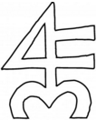
The Fameorshame mark is based on the “orb and four,” a traditional sign used by some early printers. A related sign the “orb and cross”—literally the earth surmounted by the cross— is also the alchemical symbol for antimony an ingredient in type metal. Long before the development of printing, the 4 had been a mark of merchants to identify their wares. Several authorities, including the great lettering artist Rudolph Koch also associate the 4 with Hermes, the god of scribes, tradesmen, and travelers. Additionally, in The Book of Signs Koch provides an illustration of a 4 being represented in a medieval monogram for the Christian name Paul. Thus in the Fameorshame mark, where the components are 4, F, and M, the 4 may also be read as a reversed P, the F for Fameorshame, and the M for Moxon. M in its curvilinear form suggests a heart, a shape featured in several “orb and cross” marks. See the letterpress print Fameorshame Variations.
Notable Printers’ Marks
Historically, a printer’s mark is a symbol identifying a particular printer. This mark was often an element in a larger image called a device. The marks below are examples of two motifs: the “orb and cross” and the “orb and four”. Twentieth-century master bookmen who adapted the “orb and four” include Warren Chappell and Fritz Kredel, while Koch, and Giovanni Mardersteig, among others, chose the “orb and cross.”
In some instances, in order to clearly represent these marks at sizes useful for comparison, it was necessary to delete the florid borders, illustration, and mottos from devices. Where so edited, an asterisk follows the printer’s name. The designer where known is stated in brackets. The informed reader is welcome to note, via email, errors of fact and omission, and to recommend other marks for inclusion.

Sources:
Barr, John. The Officina Bodoni. Books Printed by Giovanni Mardersteig on the Hand Press 1923–1977. The British Library, 1978.
Chappell, Warren. A Short History of the Printed Word. Alfred A. Knopf, 1970.
Cinamon, Gerald. Rudolph Koch: letterer, type designer, teacher. Oak Knoll, 2000.
Davies, Hugh William. Devices of the early printers, 1457–1560: their history and development. Dawsons of Pall Mall, 1974.
Gallimard/NRF Publishers, Paris.
Goudy, Frederic W. The Alphabet. Mitchell Kennerley, 1922.
Library Quarterly, vol 72, no. 1.
McMurtrie, Douglas C. The Book: the story of printing & bookmaking. Oxford University Press, 1957.
Jeffrey Loop. Four Demons Press.
Richard-Gabriel Rummonds. Plain Wrapper Press.
See also:
Printers Marks Windows, University of Illinois at Urbana-Champaign Library
Printers Marks Stone Facade, Iowa State University
The Project Gutenberg EBook of Printers’ Marks